The Situation
The existing experience struggled to retain users, with high bounce rates, poor mobile usability, and unclear navigation paths. Performance issues and outdated content created friction across key journeys.
- Bounce rate ~70%
- Low product discoverability
- Slow load times
What I Did
Led UX strategy across research, navigation redesign, and performance optimization—working with cross-functional teams to align business goals with user behavior.
Key Insights
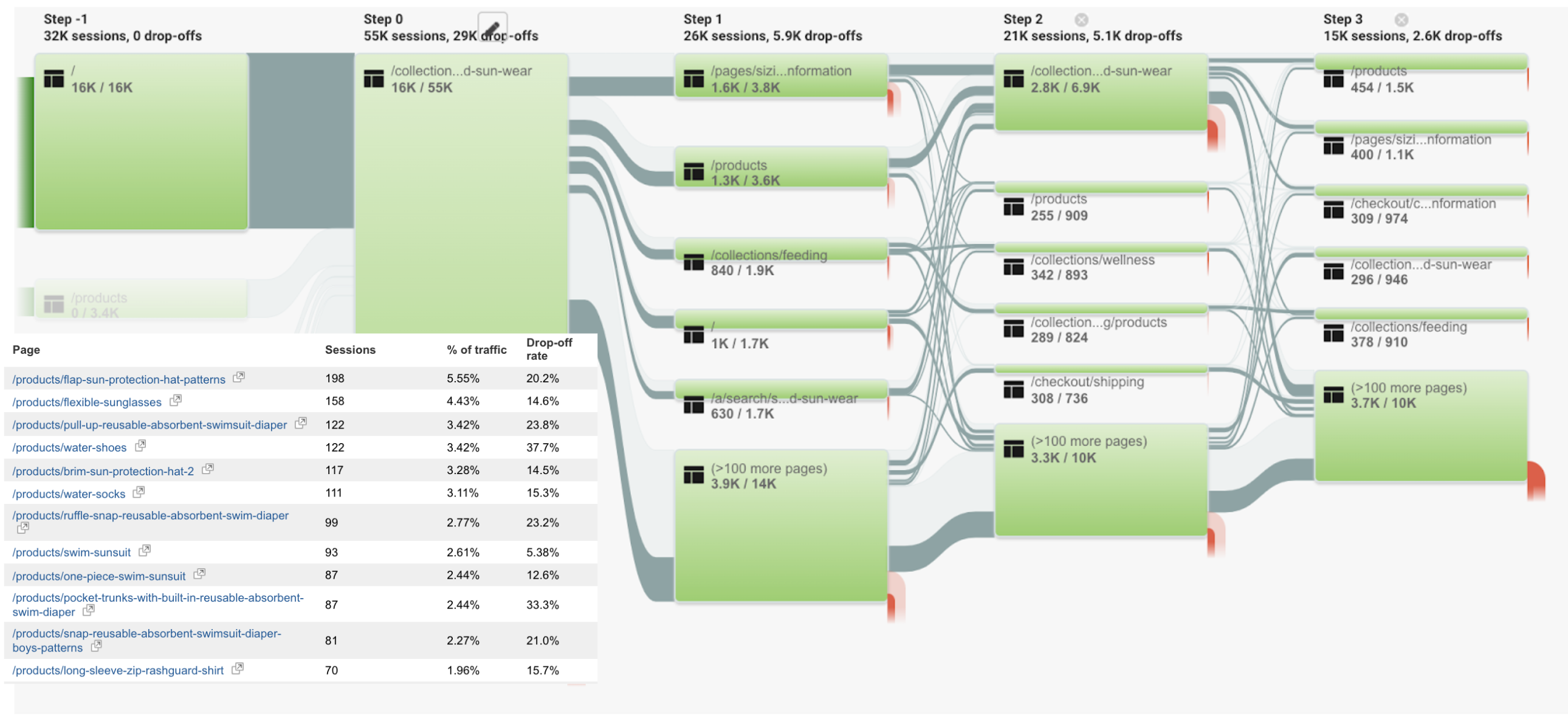
- Users took too many steps to reach product pages
- “Size Guide” had high engagement → decision friction
- Analytics data was skewed by internal traffic
Key Improvements
Navigation Redesign
Replaced a single “Shop” entry with structured navigation, category-based mega menus, and an “Ages & Stages” pathway.
Impact: Improved product discovery, reduced friction, increased session depth
Analytics Fix
Implemented IP filtering and UTM tracking to eliminate internal traffic noise.
Impact: More accurate reporting and better decision-making
Performance Optimization
Optimized images, reduced scripts, and improved loading behavior.
Impact: Faster load times and improved mobile experience
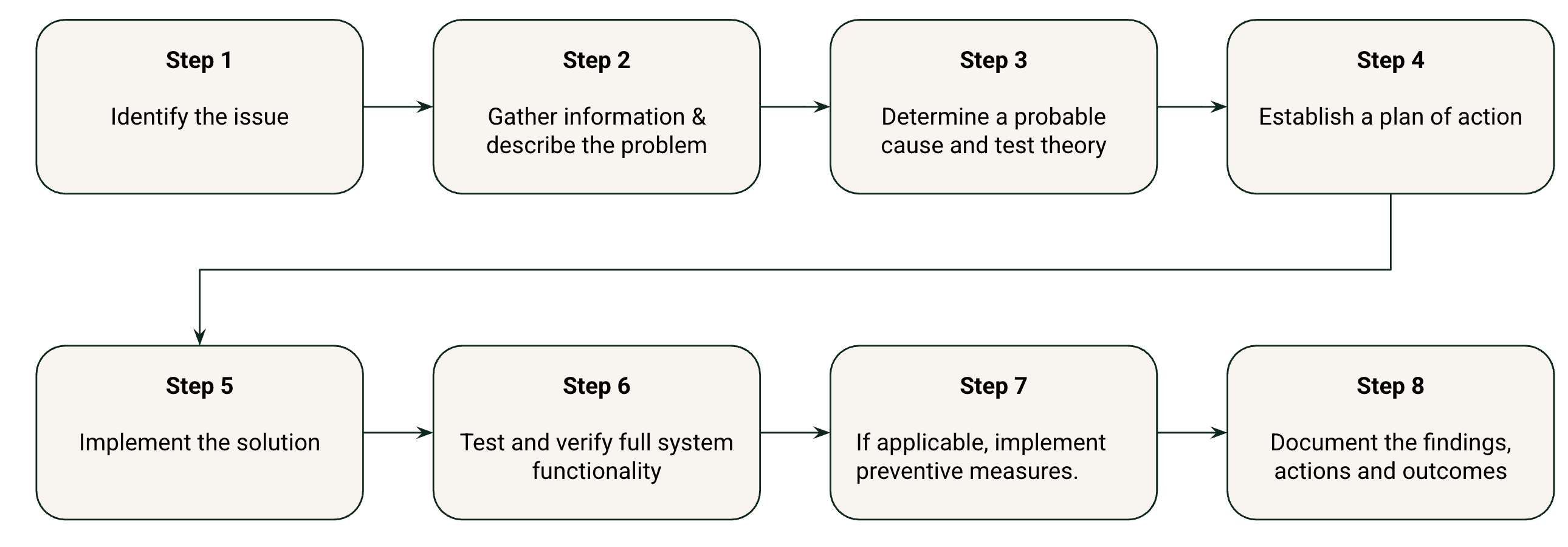
Execution
Delivered through Agile workflows using Asana. Wireframes → stakeholder alignment → high-fidelity designs → development.
Outcome
Bounce rate began trending downward shortly after implementation: By addressing mobile usability and reducing friction in navigation, users were no longer dropping off immediately. More sessions progressed beyond the homepage, indicating stronger first impressions and clearer entry points.
Time on site and session depth increased across key journeys: With improved navigation and clearer product pathways, users explored more pages per session. Instead of searching, they were discovering—moving naturally from category pages into product details.
Product discovery became faster and more intuitive: The introduction of structured navigation and “Ages & Stages” reduced the number of steps required to reach relevant products. This shift aligned the experience with real user intent, minimizing decision fatigue.
User behavior became more measurable and actionable:
Fixing internal traffic and improving UTM tracking transformed unreliable analytics into a trusted decision-making tool. This allowed marketing and product teams to confidently evaluate performance and optimize campaigns.
Performance improvements reduced early-session friction:
Faster load times—especially on mobile—helped retain users during the critical first few seconds. This contributed directly to improved engagement metrics and a smoother browsing experience.
Established a scalable UX foundation for future growth
Beyond immediate improvements, the redesign introduced a flexible structure that supports content updates, new product categories, and ongoing optimization without requiring major rework.
Mockups
Done with Adobe XD
Desktop Mockup
Mobile Mockup
Live Site